 | Web Design in a Nutshell, 2nd Edition |  |

A more sophisticated way to control the way your page looks when it is printed is to take advantage of media-specific style sheets. This feature in the CSS2 specification allows a single document to be formatted on the fly depending on the device displaying or outputting it. When it's on the screen, it looks one way; when it prints out, its format changes to be read clearly on hard copy. That eliminates the need to create a separate printer-friendly version of every page on your site. See Chapter 17, "Cascading Style Sheets" for background information on how style sheets work.
The process involves creating two style sheets: one appropriate to screen display and one appropriate for print. Both style sheets are associated with the HTML document using the media attribute or the @media rule. When the browser sends the page to print, the appropriate style sheet is chosen for the job. A more detailed explanation follows.
The downside to using any feature from the CSS2 specification is poor browser support. As of this writing, the media attribute is supported on Internet Explorer 5.0 and higher on Windows and IE 4.5 and higher on the Macintosh (IE does not support the @media rule). Navigator began supporting media types in Version 6 for both platforms. Because of the spotty browser support, you can't rely on these techniques for 100% of your audience, but if you know that your users are up-to-date with their browser downloads (such as in an intranet environment), you can begin taking advantage of them immediately.
In this simple example, I begin with a simple, yet properly tagged, HTML file that includes a navigational bar, a headline, and a few lines of text. (Structural tags have been omitted to save space, but they are implied.) I'll call this document sample.html.
<DIV class="navigation">
    <P><IMG src="navigation_bar.gif"></P>
</DIV>
<H1>Alternative Media Style Sheets</H1>
<P>With CSS2 you can create style sheets that are specific to a medium.
This enables on-the-fly formatting of the document.</P>
I now create a style sheet that specifies how I want my page to look on the screen. Just to be extreme, I've made my background black, my headline red and text gray. This style sheet is named browser.css.
BODY { background-color: black; }
H1 { color: red; font-family: impact; }
P { color: #999999; font-family: verdana; }
I also create a second style sheet that is better suited for a printout. I'd like all the text to be black on a white background. In addition, I don't want the navigation toolbar to appear, so I'll use the display selector to hide the div that contains the image. This style sheet is named print.css.
BODY { background-color: white;
color: black;
font-family: times; }
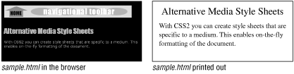
DIV.navigation { display: none;}We're not done yet -- we still need to link the style sheets to the HTML document. Figure 5-2 gives a sneak preview of the results of our media-targeted style sheets so you have an image of where this is going.
There are four methods for associating the style sheets with the HTML document. Two use the media attribute within the <link> or <style> element to target the correct style sheet from within the HTML document. The other two use rules that are dependent on medium: @import and @media. The target medium can be one of ten different media types defined in the CSS2 specification. They are:
For now, of course, we are concerned with just the values screen and print. In all of the following methods, multiple media can be specified in comma-separated lists (for example: media="print,projection"). Any style that is set to all media will combine with other media-specific styles. Therefore, if you set a master style sheet to all and a second style sheet to print, the final printed output will reflect a combination of both style sheets.
The most familiar way to target the respective style sheets is to link to them from the HTML document using the <link> element in the <head> of the document. This is a standard method for referencing an external style sheet; however, in this case, the two links are differentiated by the values of their media attributes.
<HEAD>
<LINK rel="stylesheet" type="text/css"
   href="browser.css" media="screen">
<LINK rel="stylesheet" type="text/css"
   href="print.css" media="print">
</HEAD>
By specifying that print.css has a media of print, it is called into use only when the document is printed.
A document may contain two embedded style sheets targeted at different media. The styles are differentiated using the media attribute in the <style> tag.
<HEAD>
<STYLE type="text/css" media="screen">
<!--
   BODY { background-color: black; }
   H1 { color: red; font-family: impact; }
   P { color: #333333; font-family: verdana; }
-->
</STYLE>
<STYLE type="text/css" media="print">
<!--
   BODY { background-color: white;
          color: black;
          font-family: times; }
   DIV.navigation { display: none; }
-->
</STYLE>
</HEADAn external style sheet can be imported based on the display medium using the @import rule in a style sheet. Simply add the target medium value at the end of the rule as shown in this example:
<STYLE>
<!--
@import url(browser.css) screen;
@import url(print.css) print;
-->
</STYLE>
The @media rule enables style instructions for a number of media to be placed within one style sheet. Each @media rule can be interpreted as, "If the final display is going to be this, use these style instructions." Unfortunately, it is not supported in Internet Explorer as of this writing. Using the same style sheet information from the original example, the code would look like this:
<STYLE>
<!--
@media screen {
   BODY { background-color: black; }
   H1 { color: red; font-family: impact; }
   P { color: #333333; font-family: verdana; }
}
@media print {
   BODY { background-color: white;
          color: black;
          font-family: times; }
   DIV.navigation { display: none; }
}
-->
</STYLE>
We've looked at a very simple example, but I hope it illustrates how powerful and versatile conditional style sheets can be. For complete information on using media types, read the official CSS2 specification at http://www.w3.org/TR/REC-CSS2/media.html.
|  | |
| 5.2. Printer-Friendly HTML Pages |  | 5.4. Portable Document Format |

Copyright © 2002 O'Reilly & Associates. All rights reserved.