 | Web Design in a Nutshell, 2nd Edition |  |

The real meat of style sheets lies in the collection of properties that can be applied to selected elements. The properties reviewed in this chapter reflect those provided in the CSS Level 1 specification (CSS1). The CSS Level 2 specification, released in May 1998, contains many additional properties and additional values for existing properties (see Section 17.7, "What's New in CSS2" later in this chapter). However, because only the latest browser releases are up to speed with CSS1, these properties should be enough to give you a good start in working with style sheets.
First, a disclaimer -- the explanations provided here describe how each property ought to work according to the specification. Many of these are either unsupported or buggy in Version 3 and 4 browsers. For a listing of which browsers support which properties, see the charts in Appendix E, "CSS Support Chart".
Style sheets offer controls for type presentation similar to those found in desktop publishing. The following group of properties affects the way type is displayed, both in terms of font and text spacing.
| font-family |
You can specify any font (or list of fonts, separated by commas) in the font-family property. Bear in mind, however, that the font needs to be present on the user's machine in order to display, so it is safest to stick with common fonts.
You may (and it is advisable) include a generic font family as the last option in your list so that if the specific fonts are not found, a font that matches the general style of your choices will be substituted. The five possible generic font family values are:
Serif (e.g., Times)
Sans-serif (e.g., Helvetica or Arial)
Monospaced (e.g., Courier or New Courier)
Cursive (e.g., Zapf-Chancery)
Fantasy (e.g., Western, Impact, or some display-oriented font)
Note that in the example, the first font is enclosed in quotes. Font names that contain character spaces must be enclosed in quotation marks (single or double). Generic family names must never be enclosed in quotation marks.
family name, generic family name
P {font-family: "Trebuchet MS", Verdana, sans-serif}All elements
Yes
| font-style |
The font-style property selects between normal (the default) and italic or oblique faces within a font family. Oblique type is just a slanted version of the normal face. Italic is usually a separate face design with more curved characters. Note that bold is part of font-weight, not font-style, in style sheet syntax.
normal|italic|oblique
H1 {font-style: italic}All elements
Yes
| font-variant |
Use the font-variant property to specify that an element display in small caps. If a true small caps font face is not available, the browser may simulate small caps by displaying all caps at a reduced size. More values may be supported for this property in future style sheet versions.
normal|small-caps
P:first-line {font-variant: small-caps}All elements
Yes
| font-weight |
The font-weight property specifies the weight, or boldness, of the type. It can be specified either as a descriptive term (normal, bold, bolder, lighter) or as one of the nine numeric values listed above. The default font weight is normal, which corresponds to 400 on the numeric scale. Typical bold text corresponds to 700 on the numeric scale. There may not be a font face within a family that corresponds to each of the nine levels of boldness (some may come in only normal and bold weights).
Unfortunately, the current browsers are inconsistent in support of the font-weight property. Of the possible values, only bold will render reliably as bold text.
normal|bold|bolder|lighter|100|200|300|400|500|600|700|800|900
STRONG {font-weight: 700}All elements
Yes
| font-size |
As the name suggests, the font-size property specifies the size of the text element. There are four methods for specifying font size:
Values: xx-small|x-small|small|medium|large|x-large|xx-large
Example: H1 {font-size: x-large}
Absolute sizes are descriptive terms that reference a table of sizes kept by the browser.
Example: H1 { font-size: larger }
These values specify the size of the type relative to the parent object.
Values: number + em|ex|px|pt|pc|mm|cm|in
Example: H1 {font-size: 24pt}
You can also specify font size using any of the length values described in Section 17.4.1, "Length Units" earlier in this chapter.
Example: H1 {font-size: 125%}
This specifies font size as a percentage of the inherited size. For instance, in this example the H1 will be 125% larger than the size of regular body text.
absolute size|relative size|length|percentage
All elements
Yes
| font |
The font property is a shorthand property for specifying all the available font controls in a single rule. Values should be separated by character spaces. In this property, the order of the enclosed values is important (although not every value needs to be present) and must be listed as follows:
{ font: weight style variant size/line-height font-name(s) }A valid font value must contain the size and the font name, in that order; otherwise, the value should be ignored (and is by most browsers).
font-style|font-variant|font-weight|font-size|line-height|font-family
EM {font: 12pt Times, serif}
H1 {font: oblique bolder 18pt Helvetica, sans-serif}All elements
Yes
| color |
This property is used to describe the text (a.k.a. "foreground") color of an element. For an explanation of specifying color values, see the "Color Values" section earlier in this chapter.
color name|RGB color value
BLOCKQUOTE {color: navy}
H1 {color: #666633}Block-level elements
Yes
| line-height |
In simplified terms, the line-height property sets the distance between the baselines of adjacent lines of text (the real calculation method is a great deal more complicated). In traditional publishing, this measurement is called "leading" and can be used to create different effects by adding white space to the block of text.
The default value is normal, which corresponds to 100-120%, depending on the browser's interpretation of the tag. When a number is specified alone, that number is multiplied by the current font size to calculate the line-height value. Line-heights can also be specified using any of the length units described earlier. Percentage values relative to the current (inherited) font size may also be used.
These examples demonstrate three alternative methods for the same amount of line spacing. For example, if the point size is 12 pt, the resulting line-height for each of the examples listed would be 14.4 pts.
normal|number|length|percentage
P {line-height: 1.2}
P {line-height: 1.2em}
P {line-height: 120%}All elements
Yes
| word-spacing |
This property specifies an additional amount of space to be placed between words of the text element. Note that when specifying relative lengths (such as em, which is based on font size), the calculated size will be passed down to child elements, even if they have a smaller font size than the parent.
normal|length
H3 {word-spacing: .5em}All elements
Yes
| letter-spacing |
This property specifies an amount of space to be added between characters. Note that when specifying relative lengths (such as em, which is based on font size), the calculated size will be passed down to child elements, even if they have a smaller font size than the parent.
normal|length
P.opener:firstline {letter-spacing: 2pt}All elements
Yes
| text-decoration |
This applies a "decoration" to text, such as underlines, overlines (a line over the text), strike-throughs, and the ever-beloved blinking effect.
none|underline|overline|line-through|blink
A: link, A:visited, A:active {text-decoration: underline}All elements
No, but a text decoration is "drawn through" any child elements
| vertical-align |
The vertical-align property, as it sounds, affects the vertical alignment of an element. The possible values are as follows:
Aligns the baseline of text (or bottom of an image) with the baseline of the parent element (this is the default)
Aligns the bottom of the element with the bottom of the lowest element on the line
Aligns the "vertical midpoint of the element (typically an image) with the baseline plus half the x-height of the parent" (in the words of the CSS1 Specification)
Lowers the element relative to the baseline
Raises the element relative to the baseline
Aligns the bottom of the element with the bottom of the parent element's font (its descenders)
Aligns the top of the element with the top of the parent element's font (its ascenders)
Aligns the top of the element with the tallest element on the line
percentage values refer to the value of the line-height property of the element.
baseline|bottom|middle|sub|super|text-bottom|text-top|top|percentage
IMG.capletter {vertical-align: text-top}Inline elements
No
| text-transform |
This property affects the capitalization of the element. The possible values are as follows:
Displays the element as it is typed in the HTML source and neutralizes any inherited value
Displays the first letter of every word in uppercase characters
Displays the whole element in lowercase characters
Displays the whole element in uppercase characters
none|capitalize|lowercase|uppercase
H1.title {text-transform: capitalize}All elements
Yes
| text-align |
This affects the horizontal alignment of the contained text within an element. The possible values are center, left, right, and justify (aligns both the left and right margins).
center|justify|left|right
DIV.center {text-align: center}Block-level elements
Yes
| text-indent |
This property specifies an amount of indentation (from the left margin) to appear in the first line of text in an element. The value of text-indent may be negative to create hanging-indent effects, although this feature is poorly supported. Values can be specified in any available unit of length or as a percentage of the line length.
length|percentage
P.first {text-indent: 3em}Block-level elements
Yes
Style sheets treat each element on a page as though it were contained within a box (imagine four lines drawn against the edges of this paragraph). More accurately, each element is in a series of containing boxes, beginning with the content itself, surrounded by padding, then the border, which is surrounded by the margin. The margin padding and border parts, as well as an element's width and height, are illustrated in Figure 17-2.
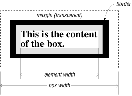
The content itself is contained within the element's width. Any background applied to an element extends into the padding space and under the border, but not beyond the border's outer edge. The entire box's width extends to the outer edges of the margin. The boundary of the margin is not visible but is a calculated amount.
The CSS1 provides many properties for controlling the presentation of an element's box, including setting the amount of padding and margin, the appearance of the borders, and the background color (discussed in the next section). The box model is also the basis for absolute positioning (discussed later in this chapter), so it is important to get a feel for how they work. For more information on how box elements are formatted and interact with each other, see Section 4, "Formatting Model" in the CSS specification online at http://www.w3.org/TR/REC-CSS1.
Box Measurements in Internet Explorer
Internet Explorer Version 6 is the first version of IE to comply perfectly with the CSS standard for box model measurements (as illustrated in Figure 17-2). Previous versions (which only partially supported box properties anyway) calculated the size of an element to include its padding, border, and margin. According to the standard, the width of the element is the same as content width.
| margin-top, margin-right, margin-bottom, margin-left |
These properties specify the amount of margin on specific sides of the element (as called by name). Values for margin-right and margin-left can be specified in length units, as a percentage based on the size of the element's overall box width, or as auto, which automatically fills in a margin amount based on other elements on the page. margin-top and margin-bottom may be specified in length units or auto (not in percentages).
length|percentage|auto
IMG {margin-top: 0px}
		IMG {margin-right: 12px}
		IMG {margin-bottom: 0px}
IMG {margin-left: 12px}All elements
No
| margin |
This is a shorthand property for specifying all the margins of an element. Values can be entered as length units, as a percentage based on the size of the element's overall box width, or as auto, which automatically fills in a margin amount based on other elements on the page.
If a single value is given, as in the first example, that value will apply to the margins on all four sides of the box.
You can combine values for each of the four sides in a list, as shown in the second example. It is important to note that the values always follow a clockwise order, as follows:
{ margin: top right bottom left }(Note that the second example duplicates the four separate rules illustrated for the margin-top, etc., properties.)
When you specify three values, the second value will apply to both the right and left margins:
{ margin: top right/left bottom }Two values, as shown in the third example, are interpreted as follows:
{ margin: top/bottom right/left }(Note that in the examples at the beginning of this section, the third example has the same effect as the second example.)
If the browser doesn't find a value for the left margin, it just duplicates the value for the right; if the bottom margin value is missing, it duplicates the value for the top.
length|percentage|auto
IMG {margin: 20px}
		IMG {margin: 0px 12px 0px 12px}
IMG {margin: 0px 12px}All elements
No
| padding-top, padding-right, padding-bottom, padding-left |
These properties specify an amount of padding to be added around the respective sides of an element's contents (the side indicated by the property name). Values are the same as explained for the margin property.
length|percentage
P.sidebar {padding-top: 1em}All elements
No
| padding |
This is a shorthand property for specifying the padding for all sides of an element. A single value will apply the same amount of padding on all sides of the content. More than one value will be interpreted as described for the margin property (top, right, bottom, left).
length|percentage
P.sidebar {padding: 1em}All elements
No
| border-top-width, border-right-width, border-bottom-width, border-left-width |
These properties specify the border widths of the respective sides of an element's box. The keywords thin, medium, and thick will be interpreted by the browser and are consistent throughout the document (i.e., they are not affected by the font size of the element). You can also specify a length unit.
thin|medium|thick|length
P.sidebar {border-right-width: medium; border-bottom-width: thick}All elements
No
| border-width |
This is a shorthand property for specifying the width of the border for all four sides of the element box. A single value will set the same border width for all four sides of the box. More than one value will be interpreted as described for the margin property (top, right, bottom, left).
thin|medium|thick|length
P.warning {border-width: thin}All elements
No
| border-color |
This property sets the border color for each of the four sides of an element box. A single value will apply to all four borders of the box. More than one value will be applied as described for the margin property (top, right, bottom, left).
color name|RGB value
BLOCKQUOTE {border-color: red blue lime yellow}All elements
No
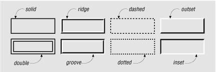
| border-style |
This property sets the style of border for an element box. The different styles are illustrated in Figure 17-3. A single value will result in a box with the same style border on all four sides. More than one value will be interpreted as described for the margin property (top, right, bottom, left). The example given would create a box with a solid line on the top and bottom and with dashed rules on the left and right sides.
none|dotted|dashed|solid|double|groove|ridge|inset|outset
P.example{border-style: solid dashed}All elements
Yes
| border-top, border-right, border-bottom, border-left |
Each of these properties is a shorthand property for setting the width, style, and color of a specific side of a box (as named). The example given would create a solid blue border .5 em thick on the left side of the H1 element only.
border-top-width|border-style|border-color
H1: {border-left: .5em solid blue}All elements
No
| border |
This is a shorthand property for setting the border width, style, and color for all four sides of an element box. The values specified in border will always apply to all four sides of the box (unlike other shorthand border properties described earlier, border cannot accept values for separate sides).
border-width|border-style|border-color
P.example {border: 2px dotted #666633}All elements
No
| width |
This property sets the width of the element and can apply to blocks (like paragraphs) in addition to things like images. If you use this on an image, be sure also to specify the height. Percentage values pertain to the width of the containing block.
length|percentage|auto
IMG.photo {width: 300px; height:300px;} P.narrow {width: 75%}Block-level elements and replaced elements (such as graphics)
Yes
| height |
This property sets the height of the element and can apply to blocks (like paragraphs) in addition to things like images. If you use this on an image, be sure also to specify the width. CSS1 does not allow percentage values for height, although CSS2 does. The percentage is still taken as a percentage of the containing block's width, oddly enough.
length|percentage|auto
IMG.photo {height: 100px; width: 100px;} P.sidebar {height:20em}Block-level elements
Yes
| float |
The float property works much like the HTML align attribute for images; it positions an element against the left or right border and allows text to flow around it. Support for the float property is poor as of this writing, but it should prove useful in the future for creating drop caps and similar effects.
left|right|none
P.sidebar {float: right}All elements
No
| clear |
This property specifies whether to allow floating elements on an image's sides (more accurately, the sides along which floating items are not accepted). none means floated elements are allowed (but not required) on both sides.
none|left|right|both
H1, H2, H3 {clear: left}Block-level elements
Yes
Background properties are applied to the "canvas" behind an element. Ideally, background color appears behind the content and its padding, stopping at the border. Background properties are not inherited, but since the default value is transparent, the parent's background color or pattern shows through for child elements.
| background-color |
Sets the background color of the element (creating a colored rectangle). The default is transparent. Navigator 4.x renders transparent as black.
color name or RGB value|transparent
P.warning {background-color: red}All elements
No
| background-image |
Sets a background image for the element. If a background color is also specified, the image will be overlaid on top of the color.
URL|none
BODY {background-image: url(stripes.gif)}All elements
No
| background-repeat |
When a background image is specified, this property specifies whether and how the image is repeated. The position from which the image does or doesn't repeat is set by the background-position property (discussed later).
Allows the image to repeat both horizontally and vertically
Allows the image to repeat only horizontally in both directions
Allows the image to repeat only vertically in both directions
Displays the image only once (does not repeat)
repeat|repeat-x|repeat-y|no-repeat
BODY { background-image: url(oldmap.gif); background-repeat: no-repeat}All elements
No
| background-attachment |
This determines whether the background image scrolls along with the document (scroll, the default) or remains in a fixed position (fixed).
scroll|fixed
BODY {background-image: url(oldmap.gif); background-attachment: scroll}All elements
No
| background-position |
When a background image has been specified, this property specifies its initial position relative to the upper-left corner of the box that surrounds the content of the element (not including its padding, border, or margin).
The CSS methods for specifying position get a bit complicated. Values are given in horizontal/vertical pairs, with a default value of 0%/0%, which places the upper-left corner of the image in the upper-left corner of the element. A value of 100%/100% would place the image in the bottom-right corner of the element.
Length values from the left and top margin can also be specified. Or you can use the keywords, which correspond to the percentage values 0%, 50%, and 100%, respectively. The two examples given create the same result, with the bottom-left corner of the image placed in the bottom-left corner of the element.
percentage|length|top/center/bottom|left/center/right
BODY {background-image: url (oldmap.gif);
 background-position: bottom left}
BODY {background-image: url (oldmap.gif);
background-position: 100% 0%}Block-level elements and replaced elements
No
| background |
This is a shorthand property for specifying all the individual background properties in a single declaration.
background-color|background-image|background-repeat|background-
attachment|background-position
BODY {background: silver url(nightsky.gif) no-repeat fixed}
BODY {background: url(oldmap.gif) bottom left}Block-level elements
Yes
These properties classify elements into categories rather than setting specific visual parameters.
| display |
This property defines how and if an element is displayed. A value of none turns off the display and closes up the space the element would otherwise occupy. (The second example given turns off all images, for instance.) block opens a new box that is positioned relative to adjacent boxes. list-item is similar to block except that a list-item marker is added. inline results in a new inline box on the same line as the previous content.
block|inline|list-item|none
P {display: block}
IMG {display: none}All elements
No
| white-space |
This property defines how white space in the source for the element is handled. The normal value treats text normally, with consecutive spaces collapsing to one. The pre value displays multiple characters, like the <pre> tag in HTML, except that the element is not displayed in a monospace font, unless you use CSS to specify such a font face as well. nowrap prevents the text element from wrapping unless designated by a <br> tag.
normal|pre|nowrap
P.haiku {white-space: pre}Block-level elements
Yes
| list-style-type |
This attribute specifies the appearance of the automatic numbering or bulleting of lists. Values are the same as for the type attribute within a list item (<li>). (In the example given, decimal corresponds to list items numbered 1, 2, 3, etc., and upper-roman results in A, B, C, etc.) These numbers/bullets will be displayed when no list-item image is specified or if the image cannot be found.
disc|circle|square|decimal|lower-roman|upper-roman| lower-alpha|upper-alpha|none
OL {list-style-type: decimal}
OL {list-style-type: upper-roman}Elements with the display property set to list-item
Yes
| list-style-image |
This property specifies a graphic to be used as a list-item marker (bullet).
URL|none
UL {list-style-image: url(3dball.gif)}Elements with the display property set to list-item
Yes
| list-style-position |
This property specifies whether list items should be set with a hanging indent. The inside value makes subsequent lines of a list item wrap all the way to the left margin of the list item (under the list item marker). The outside value starts subsequent lines under the first word of the list item, creating a hanging indent.
inside|outside
OL {list-style-position: outside}Elements with display property set to list-item
Yes
| list-style |
This is a shorthand property for setting the list-style type, image, and position (inside, outside) in one declaration.
list-style-type|list-style-image|list-style-position
UL {list-style: list-item url(3dball.gif) disc inside}
UL UL {list-style: circle outside}Elements with display property set to list-item
Yes
|  | |
| 17.4. Specifying Values |  | 17.6. Positioning with Style Sheets |

Copyright © 2002 O'Reilly & Associates. All rights reserved.